What’s the first thing you notice when you see modular display stands? The booth design, yes, but more importantly, you notice the colour scheme used throughout the stand. This brings us to the question: why do companies stress the need for aesthetic colour palettes for their 3d exhibition stall design and how does it impact the attendees?
What is Colour Theory?
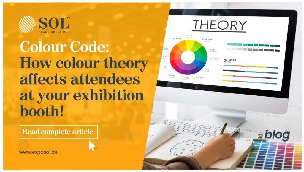
The colour theory is a multi-faceted set of guidelines to create an aesthetically pleasing colour palette using the colour wheel. In other words, it’s a collection of guidelines used to design and implement colour applications.
All the colours that we know today are divided into 3 categories: primary colours, secondary colours and tertiary colours. So, putting these colours together into wheel artists and designers create a colour palette.
So, how do exhibition stand designers come up with a colours palette for your 3d exhibition stall design? According to the colour wheel, the colours on the opposite side of the wheel are the ones that complement each other. Using this, the designers will design the booth.
How Does Colour Theory Affect a 3D Exhibition Stall Design?
As we discussed earlier, the expo booth designers will use the colour wheel to come up with an aesthetically pleasing colour palette. But why is it important?
The obvious answer is in the question, to make the 3d exhibition stall design look aesthetically pleasing. Think about it, would step into a design stall that is neon, orange, blue, pink and grey? Of course not! Why is that? Because it’s simply not aesthetically pleasing to the eye.
Piggybacking off of that, it also helps in giving the expo booth design some coherence and makes it look like a whole. Otherwise, the exhibit is just a bunch of different elements put together.
So, when attendees standing far away see your expo exhibit design, they can instantly tell what the brand is and what the booth is about.
Another important thing is that with the right colour palette, you can easily work your way around your booth theme.
How Does Colour Theory Affect Attendees?
Before entering any expo stands, the attendees will first see the 3d exhibition stall design and make about whether or not they are worth entering. Just as we eat a dish with our eyes before tasting it, the same goes for your expo exhibit design.
When modular display stands are designed keeping the colour palette and overall theme of the booth, instantly stands out and appears appealing to the attendees.
For an attendee that does not know anything about your brand, your expo booth design is the best and the only way to make your business stand out. An incoherent colour palette or one that sticks out like a sore thumb will surely attract their attention, but for all the wrong reasons.
A colour palette that strains the eye is unsettling and unappealing and will do everything but increase your design stall’s foot traffic
How to Use Colour Palette to Attract Attendees?
For decades brands have used certain colours to evoke certain emotions in their customers to get to buy their products or to simply induce them to relay certain messages.
How do they do that? Certain colours are associated with certain emotions and industries altogether. Some of these colours are discussed below.
Yellow stands for happiness, positivity, optimism, warmth and welcoming. This is also a colour popularly associated with service brands such as DHL, Nikon, Ikea and so on. While blue is associated with trustworthiness and increasing productivity. Thus popularly seen in corporate brands.
Green on the other hand is for nature, natural things, serenity, health. Thus, it’s closely related to environmentally-friendly brands and ones associated with nature.
Similarly, pink and purple are associated with femininity, youth, health, admiration and are thus, mostly used by cosmetic and skincare brands.
Keeping these colours and your theme in mind, the exhibition stand designers will create a stand that will use the colours and hues to highlight the theme.
We hope this article helped you understand how colour theory can affect a 3d exhibition stall design and attendees.
The right colour palette can make or break a booth stand design and goes a long way in dictating how attendees will perceive the exhibit. Not only does it make your booth look aesthetic it also helps in elevating the attendee experience.
Tip of the Day: If you don’t want certain colours or want to increase your brand awareness, you can always opt for your brand colours in your colour palette.
If you need assistance in building creative exhibition stands for upcoming exhibition events, look no further. At Expo Sol, our team of 50+ dedicated professionals with over a decade’s worth of experience will help you out. Contact us today for more details.