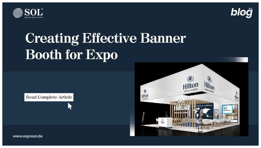
According to expo data, visitors will spend an average of eight hours perusing exhibits. More than 80% of the visitors are able to make purchases. An attractive banner booth design is essential for drawing their attention to your own exhibition.
Here’s how to make an eye-catching banner booth that will help you stand out from the crowd:
Aim for the stars
All passers-by should be able to see your contact details. Because a banner stand is placed on the floor, contact information such as a phone number or website should be provided at the top. This raises it above the heads of all passers-by.
Your contact information differs from your slogan. The dominant typeface will be used for the tagline, which is the banner’s main statement. To avoid confusion with the tagline’s message, use a smaller font for contact information. Although logic may lead you to believe that the tagline should be near the bottom, the message on a banner at a exhibition must be extremely visible to throngs of people on the go.
Simplicity
Make a brief, memorable phrase that piques interest in your product or service. Remember that putting up a banner booth is similar to striking up a conversation. To begin, you must entice them with something brilliant.
A banner booth serves as an invitation to see what’s within the exhibit. Because it takes a long time to read a banner, you’d rather not have a throng gathered under it. Keep it brief, straightforward, and clever.
Otherwise, the mob would not only prevent people from entering your exhibition, but they will also obscure passers-vision. by’s To be more detailed:
- Create a banner booth with no more than 10 words.
- Make sure your text is no more than two lines long.
- Make use of bold text.
Additionally, any secondary information on your banner booth that may alter in the future should be avoided. This can disseminate misleading information and lead to people being misled. If you mention prices, for example, you must ensure that they remain consistent. You might choose to leave off a physical address for the time being if there will be a future location shift.
The Importance of Color
Although you want a bold font for your tagline, a bold backdrop colour for your fair booth design isn’t necessary. If you solely focus on a bright colour without considering proper palette contrasts, you may end up with a banner booth that appears unprofessional and manufactured in bad taste. Consider some of the most successful marketing campaigns and the colour schemes that represent their brand:
- Facebook: royal blue background with white lettering
- Puma: white background with black text
- John Deere’s logo is yellow on a green backdrop.
Each brand is identified with the colour of its logo as well as the product. Green, a hue associated with agriculture, was also chosen by John Deere as the company’s colour.
Consider your industry, product, service, and message while creating your own banner booth. Choose colours that are compatible with the theme of your company. It’s possible that a soft aqua backdrop with bold royal blue writing is more effective for you than a bright red background with black script.
If you want a more rejuvenated look, bright blues with white writing can be a good choice, while darker colours like leather and mahogany have a richer and almost opulent appeal.
Whatever colour combinations you use, you must guarantee that your design choices are of great quality and stand out for all the correct reasons.
Readability
If no one can read the writing, it doesn’t matter how perfect your colour scheme is or how pithy and fascinating your tagline is. It’s all about the font. If you’re selling Victorian-inspired paintings, you might be tempted to choose a flourished typeface. It’s not a good idea.
When expo attendees and potential customers scan banners for the next booth that appears good, if they can’t read your banner in a matter of seconds, they may pass you up entirely. Choose a font that is simple to read, clear, and crisp.
Imaging
The same rule applies to photos in a banner as it does to text. Don’t overcrowd the space. Make use of high-resolution photos. Rather than using many images that demand more time to look at the banner, choose a single image or graphic that makes a strong statement. You want to get their attention, not tell them the complete stories that take place inside the display booth.
Also, avoid utilising pixelated photos. This means you won’t be able to just go online and look for an image to utilise on your fair booth design using a search engine. The image must be professional and of excellent quality in order to provide a greater return-on-investment than the base pricing.


